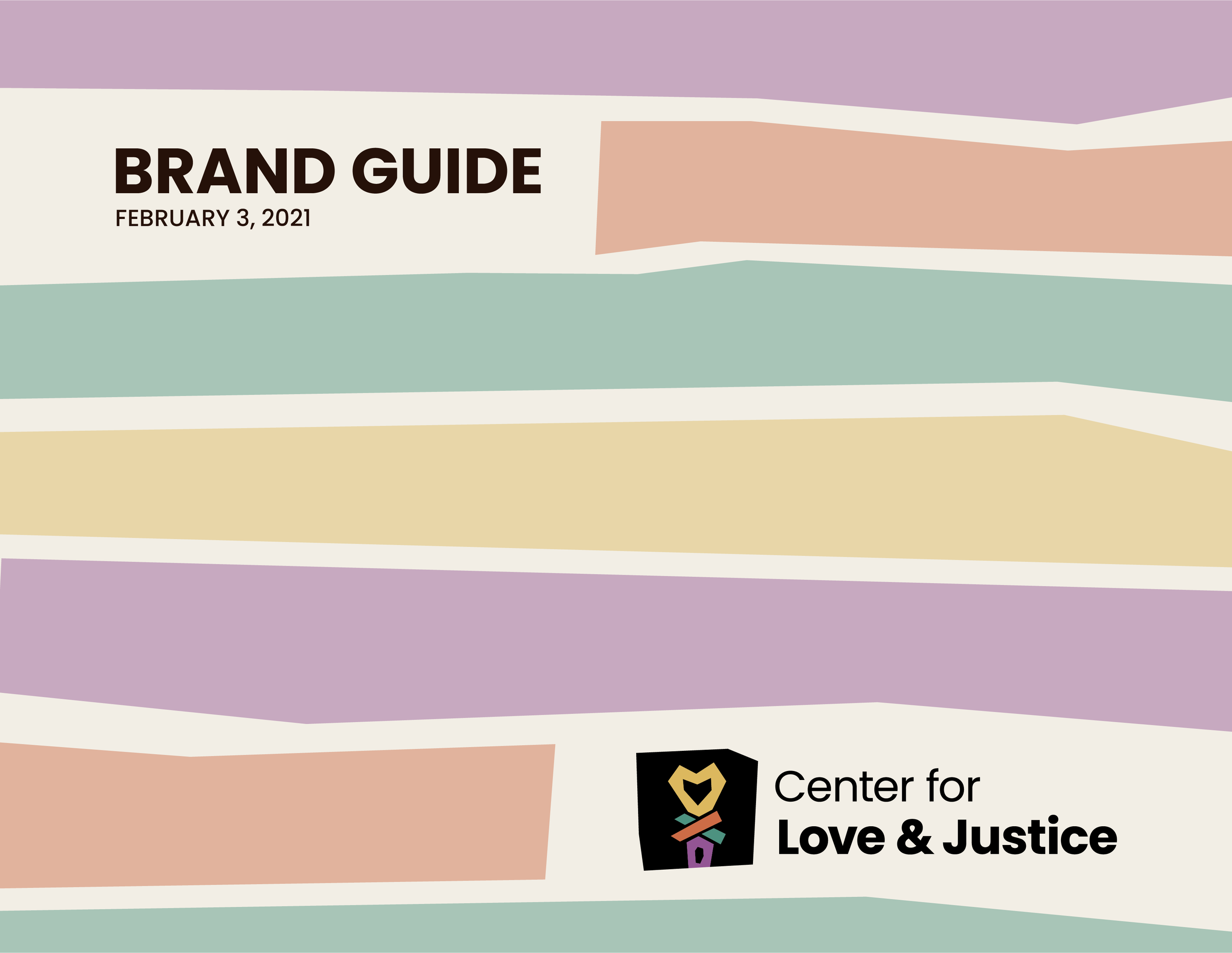
Center for Love & Justice Rebrand
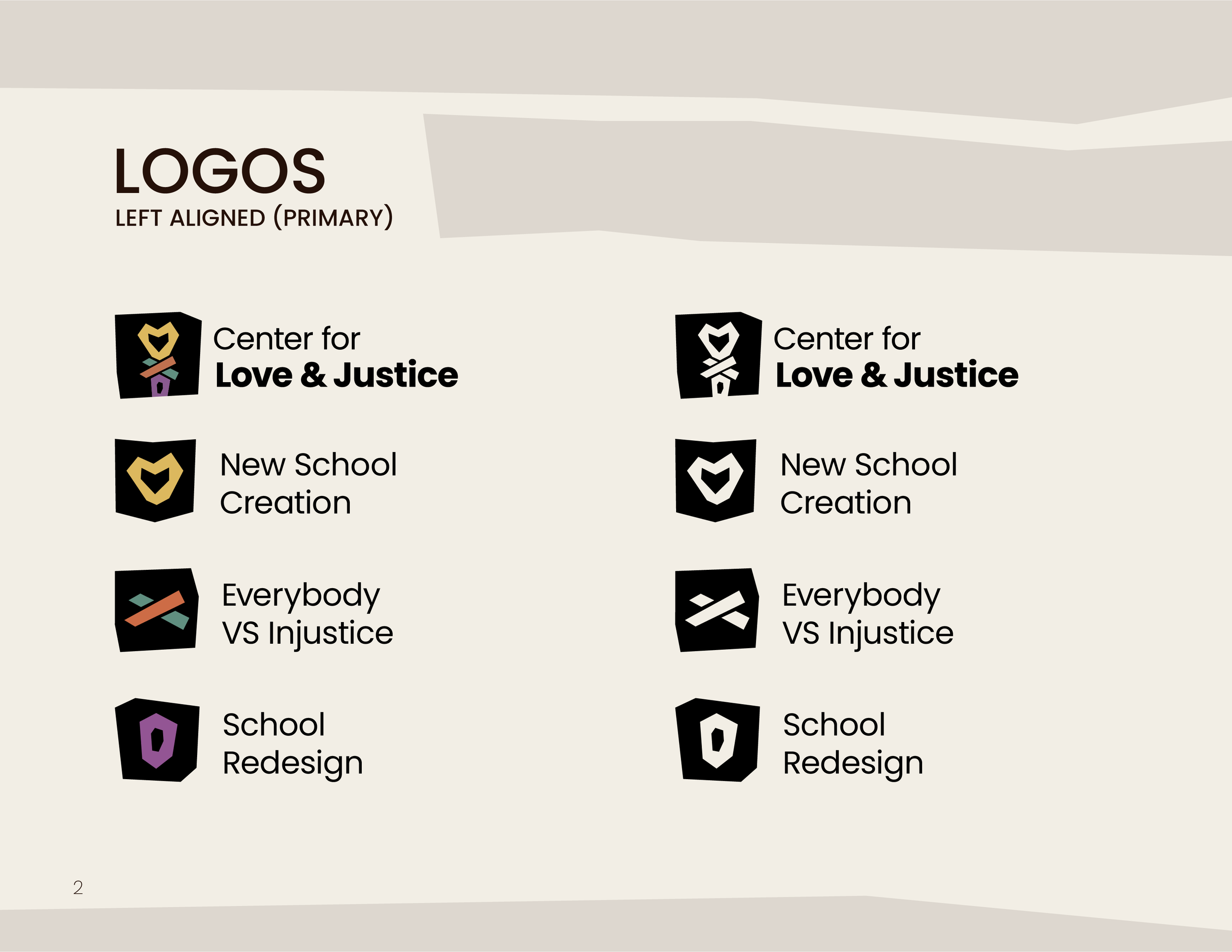
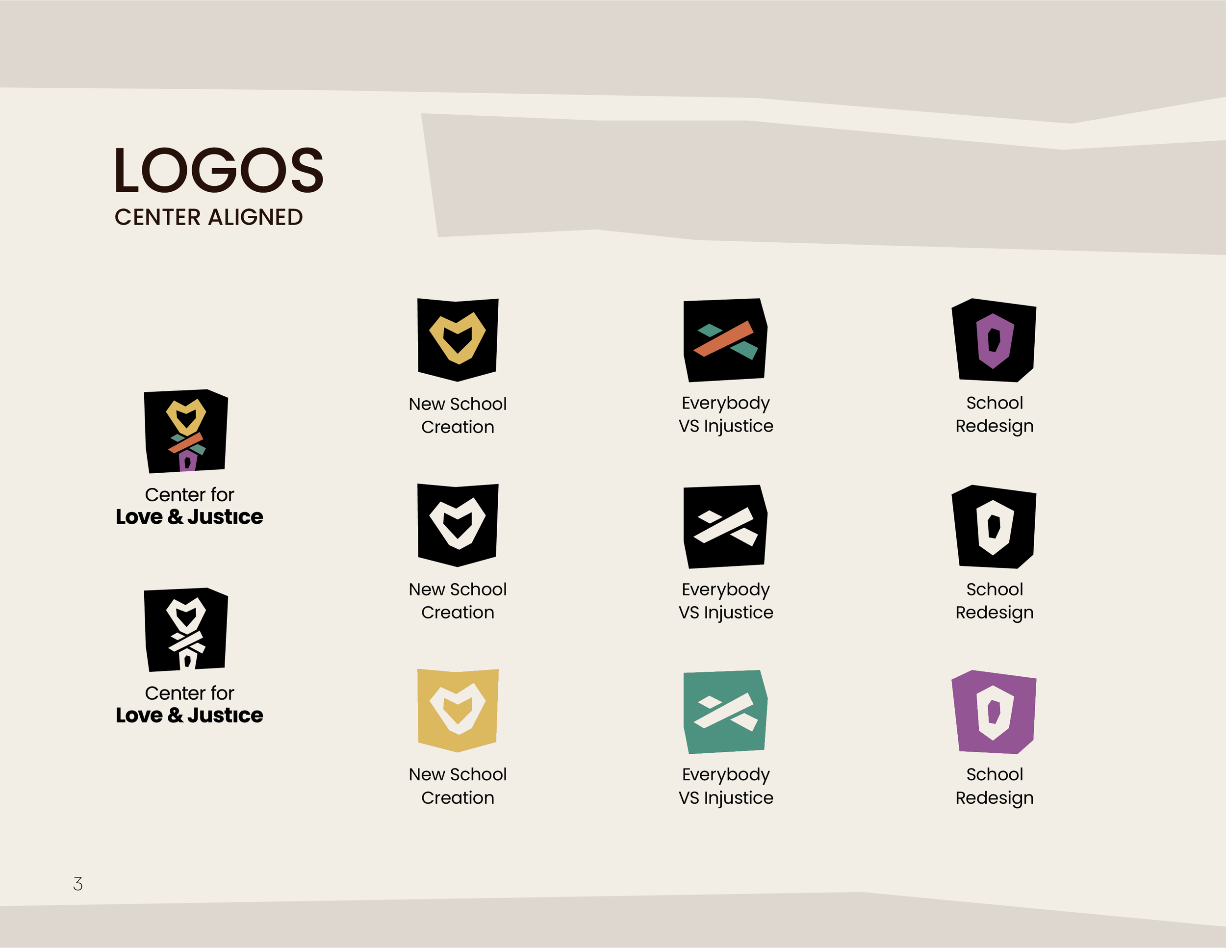
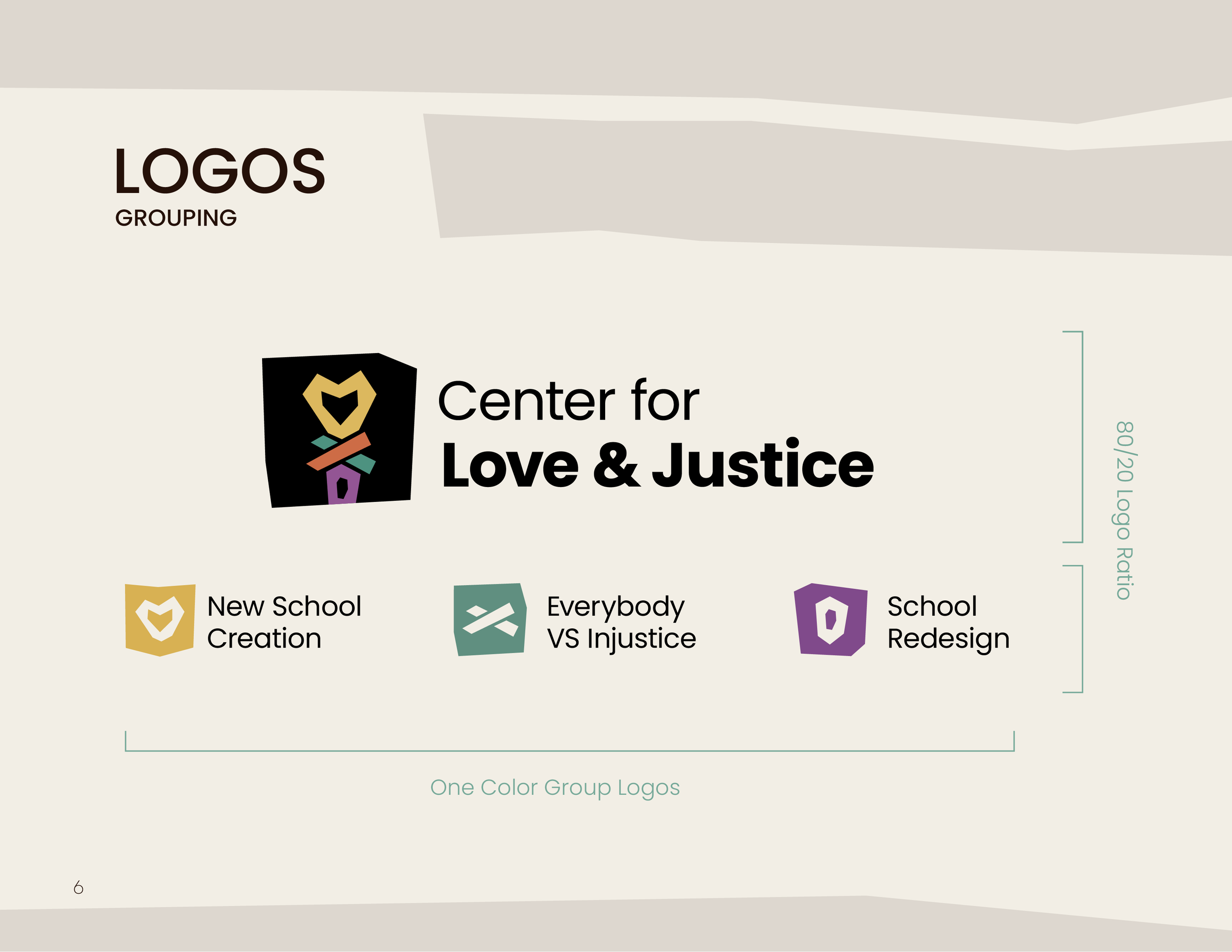
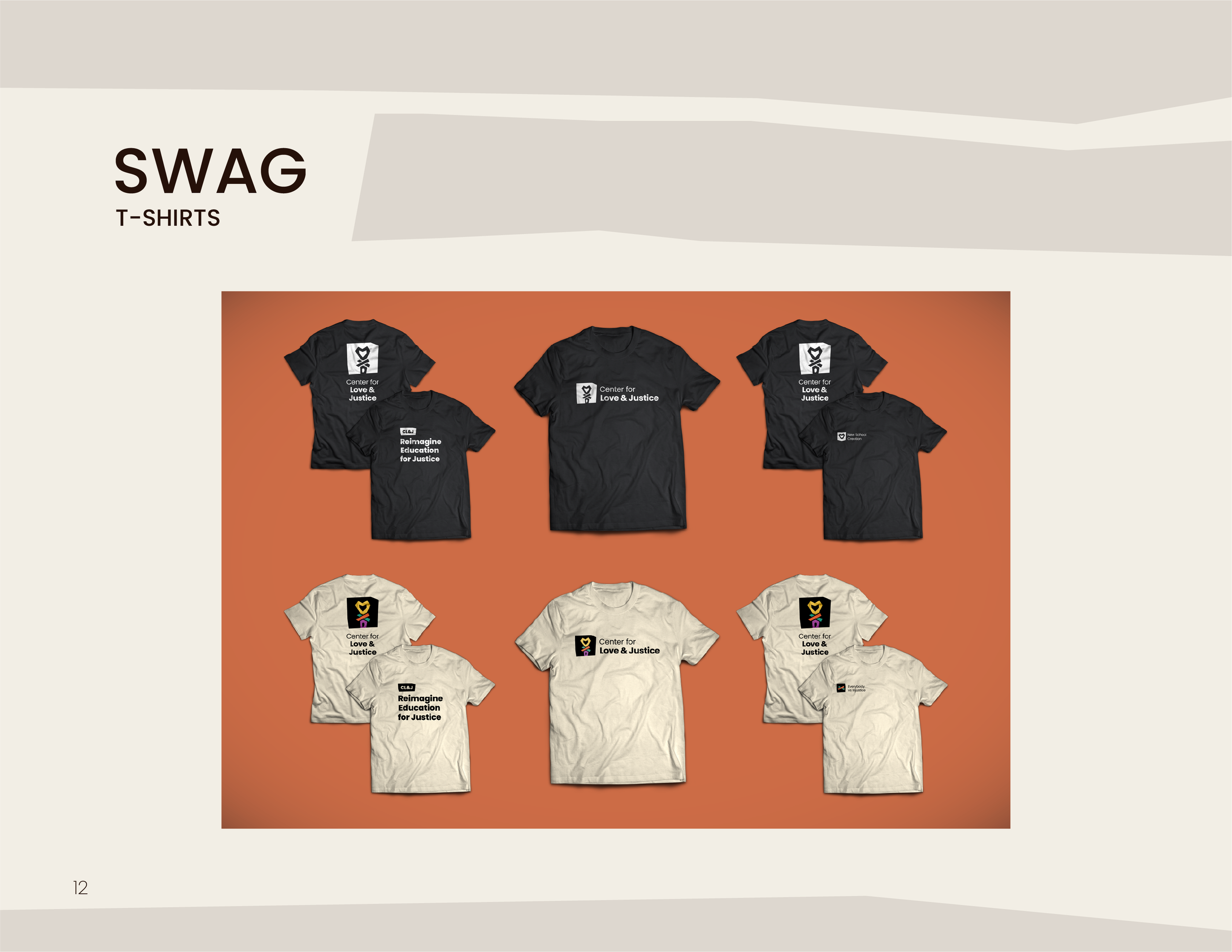
The Center for Love & Justice is a K-12 educational equity nonprofit with three legs: New School Creation, Everybody VS Injustice and School Redesign.
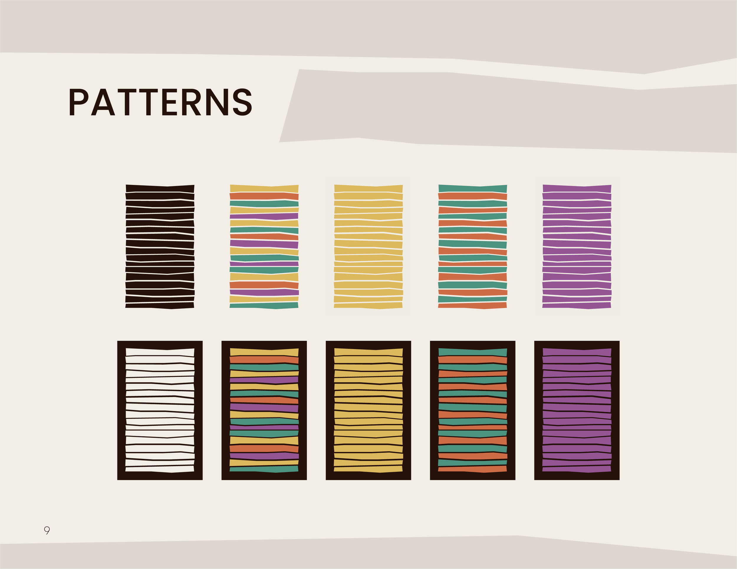
The brand’s focus was on symbolizing a "metaphorical tapestry" alluding to natural elements, community, and of course, love, and justice. The colorful and playful unifying mark is loosely inspired by the Celtic Love Knot — dissecting into three parts which coincide with each leg of the organization.
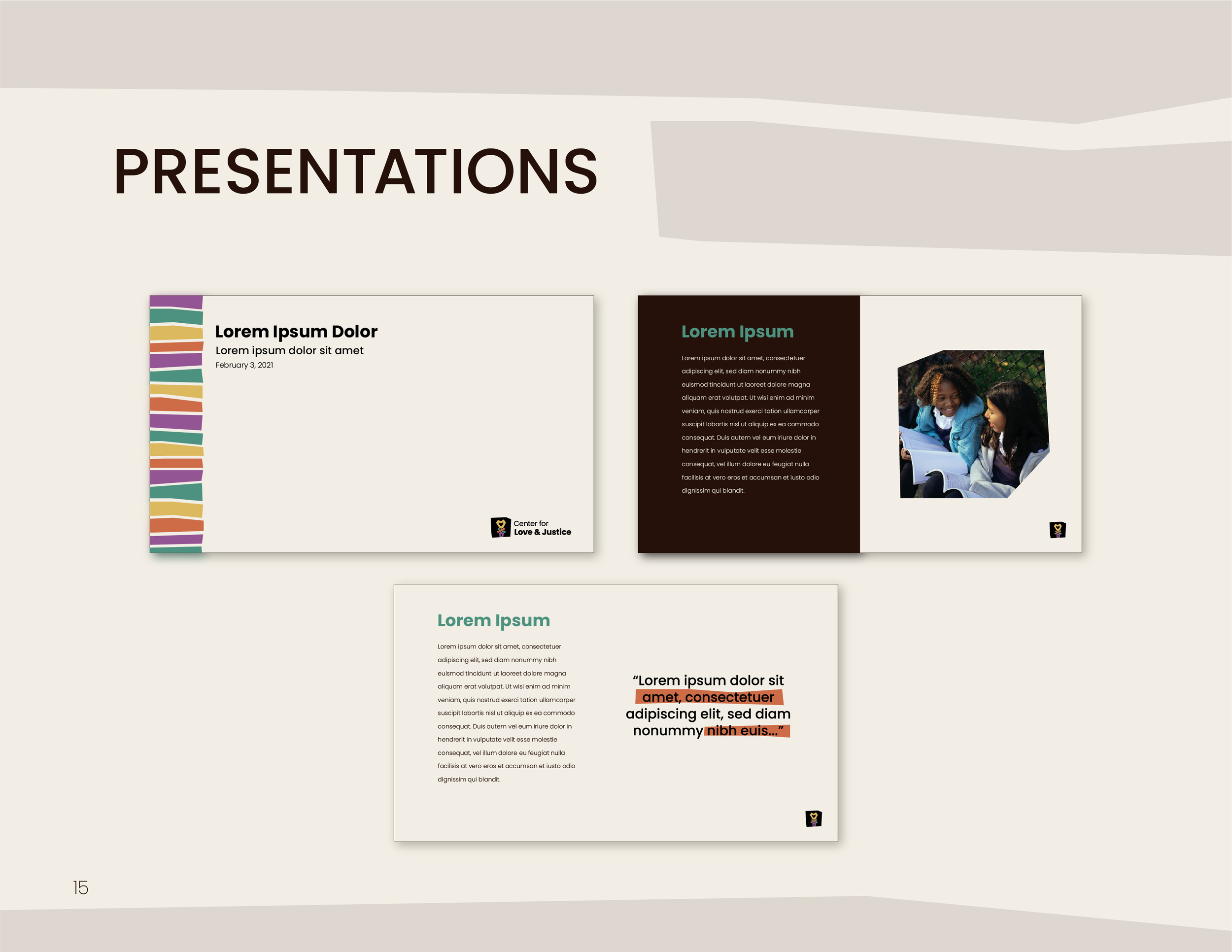
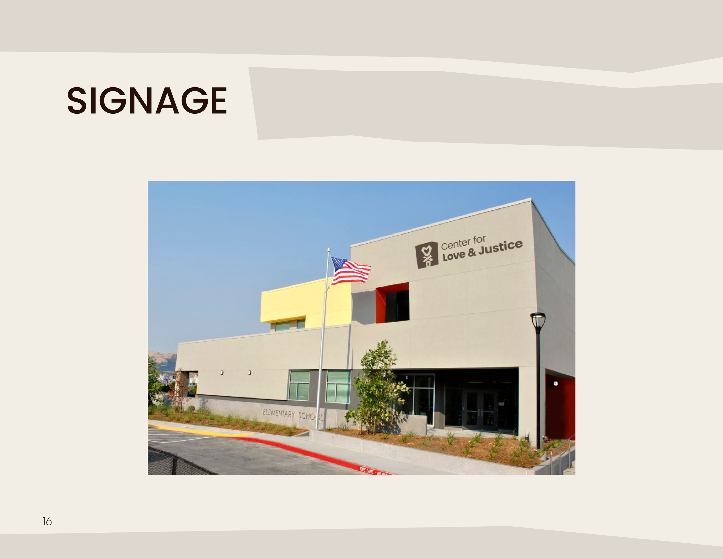
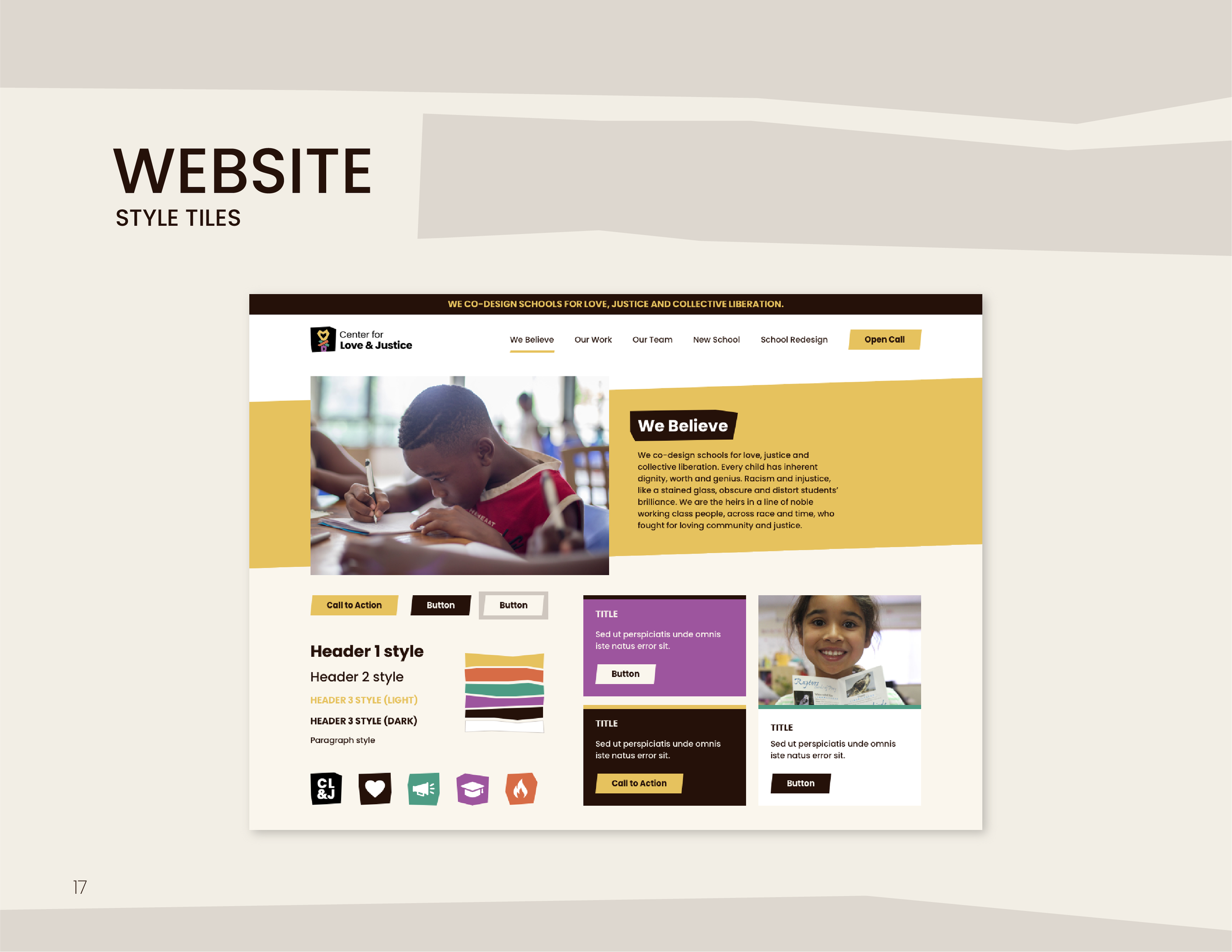
Project: Rebranding + Website Direction + Brand Collateral
Tools: Adobe Illustrator, Adobe Indesign, Adobe Photoshop, Google Suite
Role: Lead Designer under FreshForm Design Agency
Sketches

Preliminary Hand Sketches

Macrame Knot Research